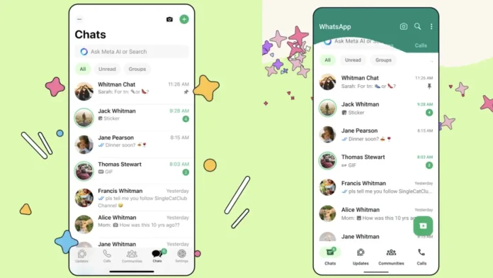
WhatsApp has announced a significant redesign for its iOS and Android apps, but the reception on X has been mixed at best.
The updated layout, while not a complete overhaul, introduces notable changes. On both platforms, the search function takes center stage at the top, followed by tabs for quick access to unread messages and groups. Additionally, a row of icons at the bottom grants users easy access to Chats, Updates, Communities, and more. Notably, this bottom row of icons is a new addition for Android users.
However, the most noticeable change for iOS users is the shift from the traditional blue color accent to a predominant green hue, bringing the app in line with its Android counterpart.
While maintaining visual consistency across platforms is understandable, the departure from the familiar blue has sparked discontent among some users on X. Comments expressing nostalgia for the old blue theme and dismay at the green takeover abound, with some users passionately pleading for the return of the beloved blue.
“I seriously freaked out when that green came into my face. We need the blue back,” lamented one user, echoing the sentiments of many others. “I still have the blue and I hope it stays like this forever,” chimed in another.
In all this everyone is just yelling “BRING THE BLUE BACK.”


